A three-week concept tea brand and packaging project aimed at the 45-55 age demographic. The brand was launched in Millport on the Isle of Cumbrae in 1884 as a family business and has since grown and made its way into mainland UK. It has strong ties to its heritage and roots on the island.
KAMES
Brand Identity
Packaging Design


APPROACH
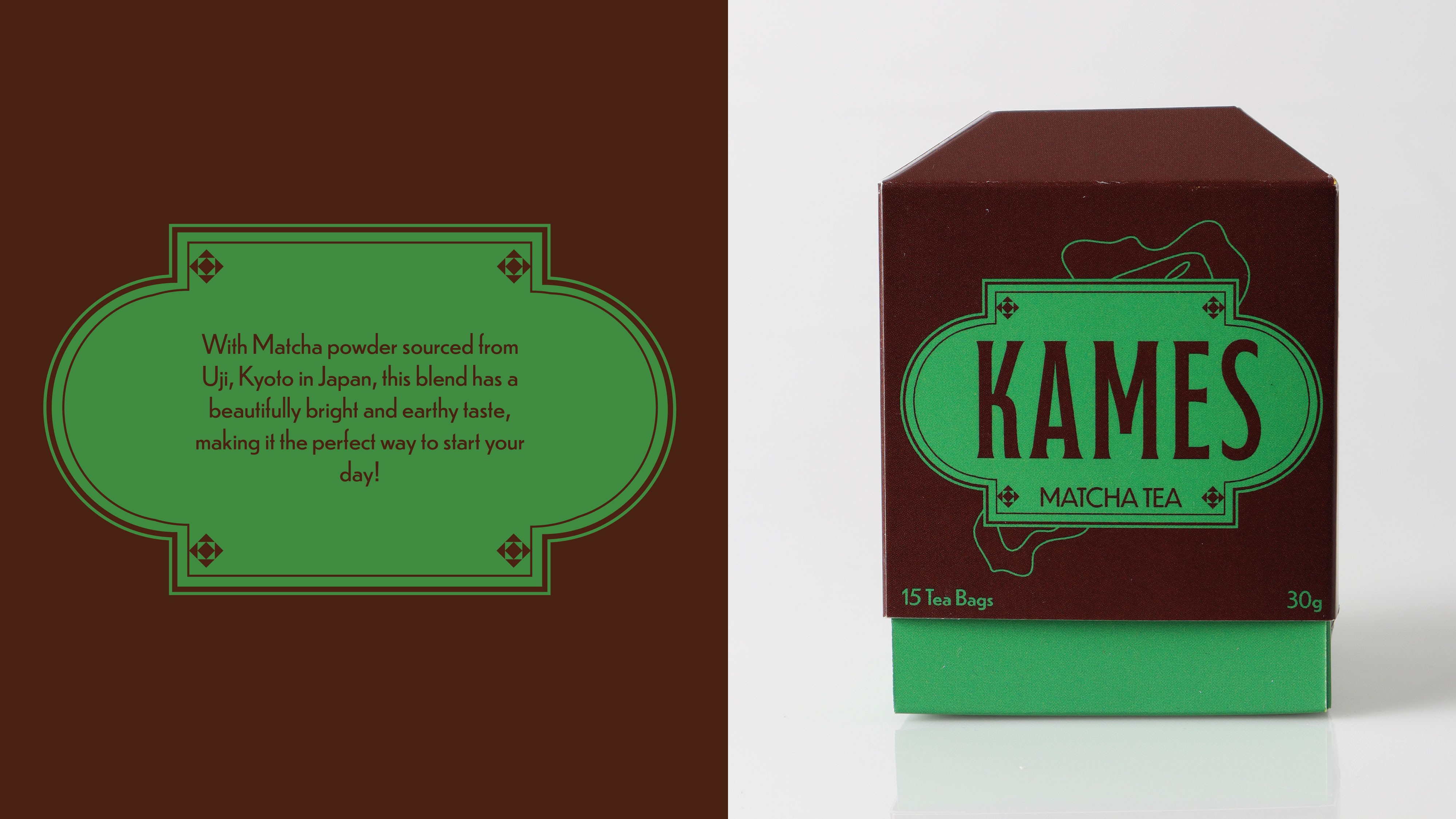
I decided on the theme of adventure for the visual direction of this project as this ties directly to Millport and the wider Isle, keeping those initial connections strong. I also took some inspiration from 1880s style design which is seen through the shapes used on the packaging. The structure of the packaging was inspired by the shape of a tea bag and was created as a way to make this product stand out amongst competitors when on the shelves in the supermarket. The brown, earthy tone is used to emulate a feeling of adventure and link back to Millport and the walking trails available there.


A three-week concept tea brand and packaging project aimed at the 45-55 age demographic. The brand was launched in Millport on the Isle of Cumbrae in 1884 as a family business and has since grown and made its way into mainland UK. It has strong ties to its heritage and roots on the island.
Brand Identity
Packaging Design
KAMES
APPROACH
I decided on the theme of adventure for the visual direction of this project as this ties directly to Millport and the wider Isle, keeping those initial connections strong. I also took some inspiration from 1880s style design which is seen through the shapes used on the packaging. The structure of the packaging was inspired by the shape of a tea bag and was created as a way to make this product stand out amongst competitors when on the shelves in the supermarket. The brown, earthy tone is used to emulate a feeling of adventure and link back to Millport and the walking trails available there.
A three-week concept tea brand and packaging project aimed at the 45-55 age demographic. The brand was launched in Millport on the Isle of Cumbrae in 1884 as a family business and has since grown and made its way into mainland UK. It has strong ties to its heritage and roots on the island.
KAMES
Brand Identity
Packaging Design
APPROACH
I decided on the theme of adventure for the visual direction of this project as this ties directly to Millport and the wider Isle, keeping those initial connections strong. I also took some inspiration from 1880s style design which is seen through the shapes used on the packaging. The structure of the packaging was inspired by the shape of a tea bag and was created as a way to make this product stand out amongst competitors when on the shelves in the supermarket. The brown, earthy tone is used to emulate a feeling of adventure and link back to Millport and the walking trails available there.